The Internet Misses 2016… And So Do Our Homes

The internet’s 2016 revival
The internet has collectively decided that 2016 is making a comeback in 2026. TikTok searches for “2016” have surged, and over 55 million videos now feature the platform’s rose-tinted 2016 filter, designed to recreate the nostalgic, slightly grainy aesthetic of early Instagram. Content creators are sharing throwback photos from 2016, posing in front of statement murals, wearing graphic tees, using the iconic Snapchat dog filter and layering high-contrast edits onto every image.
This resurgence isn’t just about aesthetics, it’s about how that era felt. Social media was messier, more spontaneous and far less curated. The internet felt less judgemental and more like a space to experiment, have fun and express personality without polish. That mindset didn’t just influence fashion and lifestyle, it also shaped interior design in a big way.

Why 2016 interiors still resonate
Looking back, it makes emotional sense that 2016 interiors are having a moment again. It was a time when homes were louder, more expressive and unapologetically personal. There were no rigid rules. Colour, texture and pattern were mixed freely, often in ways that felt instinctive rather than styled for perfection. Saturation was celebrated, particularly with the rise of millennial pink.
In 2016, millennial pink dominated interiors, fashion and branding alike. Pantone crowned Rose Quartz and Serenity its colours of the year, and these soft pastel tones appeared everywhere, from Glossier packaging to Instagram grids and living rooms. That playful, optimistic colour palette defined the era.
Today, millennial pink has evolved. Instead of soft pastels, interiors are leaning towards deeper, richer hues that feel more grown-up and luxurious. Cherry reds, burgundies and chocolate browns are emerging as modern alternatives, adding depth while still nodding to that expressive 2016 energy.

The return of brown and warmer neutrals
Brown has been a staple neutral for decades, though it was largely dismissed throughout the early 2000s. It made a brief comeback in 2016 with a retro edge, and in 2026 it’s returning again, this time with a warmer, richer interpretation. Think earthy browns, soft chocolates and caramel tones rather than flat or muddy shades.
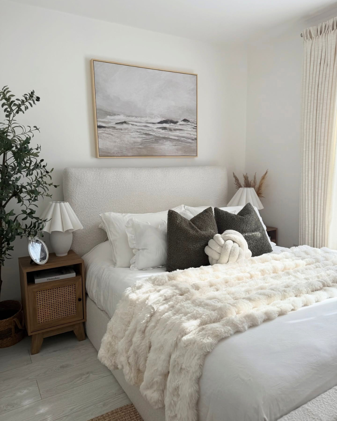
The key to successfully using brown in interiors is texture. Layering materials like wood, linen, boucle and stone creates warmth and comfort, while earthy colour palettes work beautifully alongside natural finishes. This approach pairs seamlessly with Scandinavian interiors, a high-traffic design style in 2016.
While the core principles of Scandinavian design remain, the trend has evolved into what we now recognise as Japandi interiors. Where 2016 Scandinavian spaces leaned heavily on minimalism, clean lines and cool neutrals, today’s version feels softer and more lived-in. Natural textures, plants and tactile materials make homes feel inviting, homely and calm rather than sparse.

Bohemian decor: then and now
Bohemian decor was one of the defining interior trends of 2016, heavily influenced by Tumblr and Pinterest culture. Homes embraced a free-spirited, layered aesthetic that prioritised self-expression over restraint. Bedrooms featured woven wall hangings, patterned tapestries and an abundance of houseplants, creating spaces that felt personal rather than showroom-ready.
Accessories were eclectic and often sourced from markets, vintage shops or independent sellers. In 2016, nothing was too much. If it expressed your personality, it belonged in your home. Clutter was accepted and minimalism took a back seat.
Today, the bohemian look has matured. While personality and individuality still matter, there’s a stronger focus on intentional purchases. Natural materials, heritage pieces and items with a story take priority over excessive or purely decorative choices. The result is a more curated, meaningful version of boho that still feels relaxed and expressive.

A look back at 2016 design trends
We revisited Vogue’s article “The biggest home decor trends of 2016” to reflect on the defining colours and design choices of the year. Alongside millennial pink and rose quartz, grey emerged as a dominant colour, particularly for soft furnishings. Grey was seen as a modern step up from beige, understated yet contemporary. Grey sofas, artwork and kitchen worktops were everywhere, making it one of the most recognisable interior trends of the time.
Suzani lampshades were another standout trend, offering an accessible way to introduce pattern without overwhelming a space. Hand-embroidered textiles became popular, reinforcing the move towards artisanal detail. Patterns leaned towards large-scale florals, bold botanicals and tropical influences, including leopard print and jungle-inspired motifs.
Black also began to replace white as a neutral, especially in kitchens. Black cabinets, worktops, dinnerware and accessories were paired with blush tones, rose gold and metallic finishes to create contrast. This marked a shift towards bolder, more dramatic interiors and gave design lovers new ways to experiment with depth and contrast.
2016 also saw a clear revival of 1970s design, a trend that is confidently returning again now. Jewel-toned colour palettes, rich textures, geometric patterns and an appreciation for antiques all played a role in shaping interiors that felt expressive and characterful.

What we’re leaving behind
While the 2016 revival is exciting, it wasn’t without its flaws. Many interiors of that era were designed primarily for photos rather than everyday living, which meant trends dated quickly. The overuse of grey, particularly when paired with cool lighting, often resulted in spaces that felt clinical rather than comforting.
In 2026, interiors are shifting away from that cold aesthetic. We want homes to feel cosy, charming and restorative. Spaces that function as sanctuaries, not just backdrops for content.
Should we embrace 2016 interiors again?
So, should we welcome the return of 2016 interiors? In many ways, yes. The mindset of that era is worth embracing. Confidence with colour, personality-led spaces and a more playful, free-spirited approach to design all feel relevant again. Homes should reflect the people who live in them, not resemble showrooms.
However, this revival isn’t about copying and pasting old trends. Instead of feature walls and single-colour drenching, today’s interiors favour thoughtful palettes and warmer woodwork that feels calm yet confident. It’s about taking the best parts of 2016 and reworking them for modern living, creating spaces that feel bold, balanced and timeless.
Feeling Inspired?
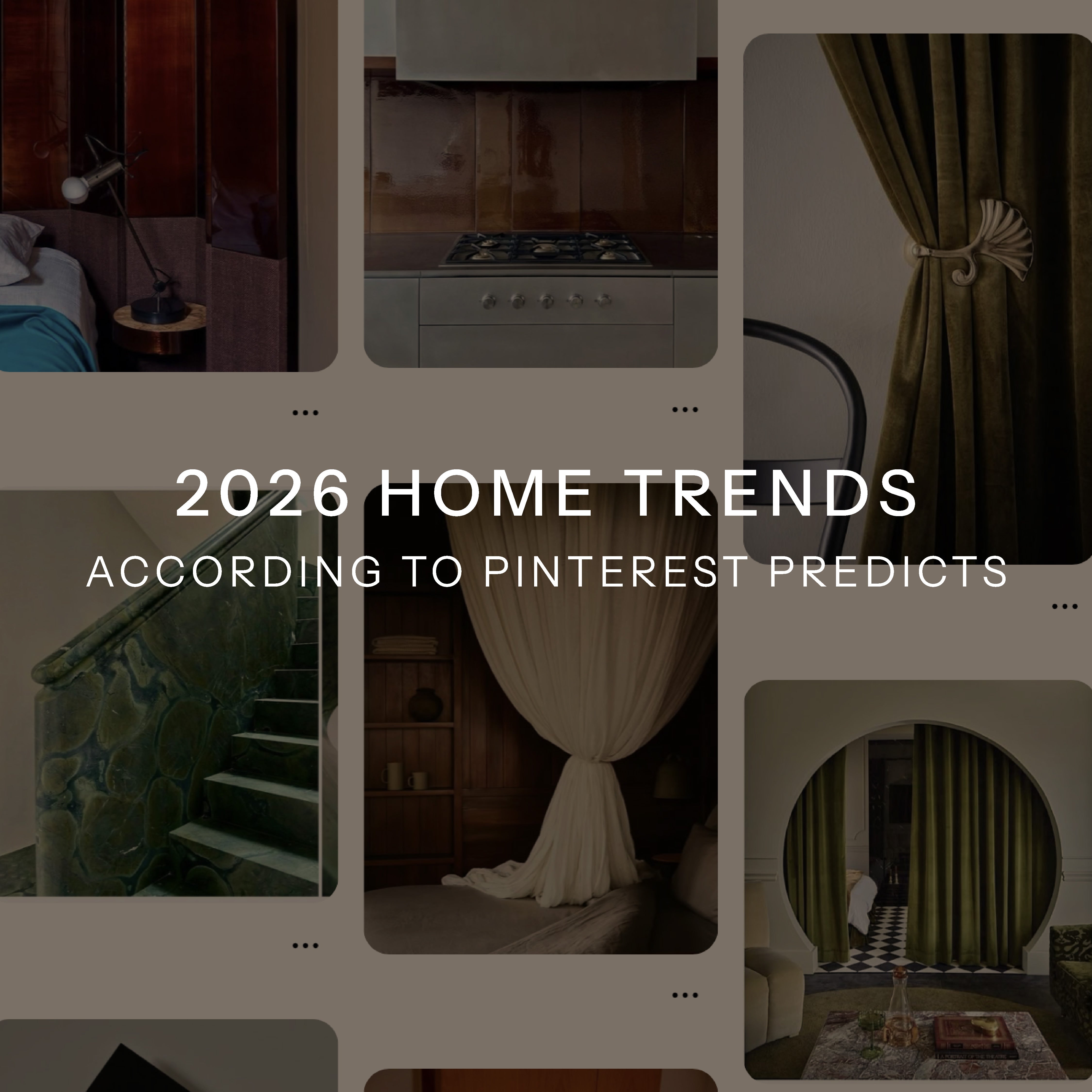
Explore the 2026 Home Trends According to Pinterest Predicts.


